Safaricom Foundation Report
Challenge
Type
Role
UI/UX design
Web development
Tools
Figma
WordPress
Live project

My Approach
The solution was a light and simple website with an interactive PDF. The homepage gives a summary of the progress and achievements made and a call to action that leads to the interactive PDF. The interactive PDF consists of auto page flip, slideshow and an option to download it as a regular PDF.
Why this approach? It was partly based on the reference the client provided: in the previous years, they simply summarized the report into a concise landing page consisting of key highlights and then provided a download button linking to the PDF report.
But why be boring? What if someone simply wants to read the report without downloading the whole PDF? Enter interactive PDF. A smart way of delivering an otherwise stiff document into a more engaging digestible matter. The proposed interactive PDF was even responsive and fluid so the experience would be seamless regardless of the device it was being consumed through.
The process began by collecting and understanding the client brief: an engaging website that gives viewers details on the foundation’s work in the past financial year and access to the full details via a PDF.
Version 1: The failed corporate minimal look
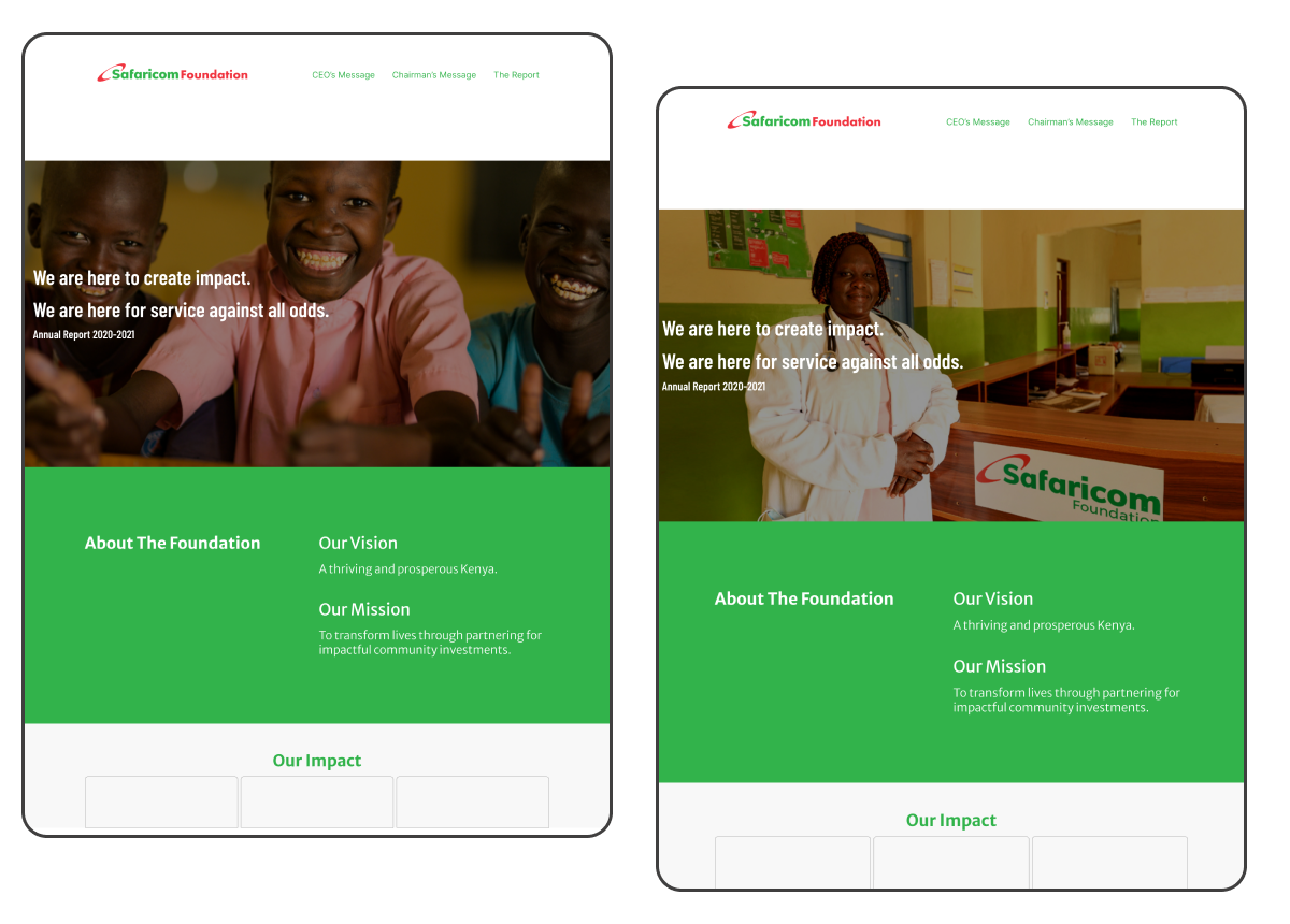
The first version was a clean corporate look, no bells and whistles. I chose this layout based on the client’s direction of using a similar layout from the previous year’s project they had undertaken with a different designer. That project unofficially set the standard: a simple layout that incorporated the brand’s style guide.
Staying on brand and following the reference given, I designed a clean corporate layout just like the client wanted. This was going to be the fastest project delivered! So I thought. The outcome? The client hated it. The outcome was a humdrum website, nothing exciting. It felt like a cookie cutter generic website layout.
I needed to push the boundaries while still staying on brand to bring this project to life…and to restore the client’s positive vibes. It turns out the customer is not always right even when you do exactly what they asked. Tis the life of a designer.
Version 2: Creativity through collaboration
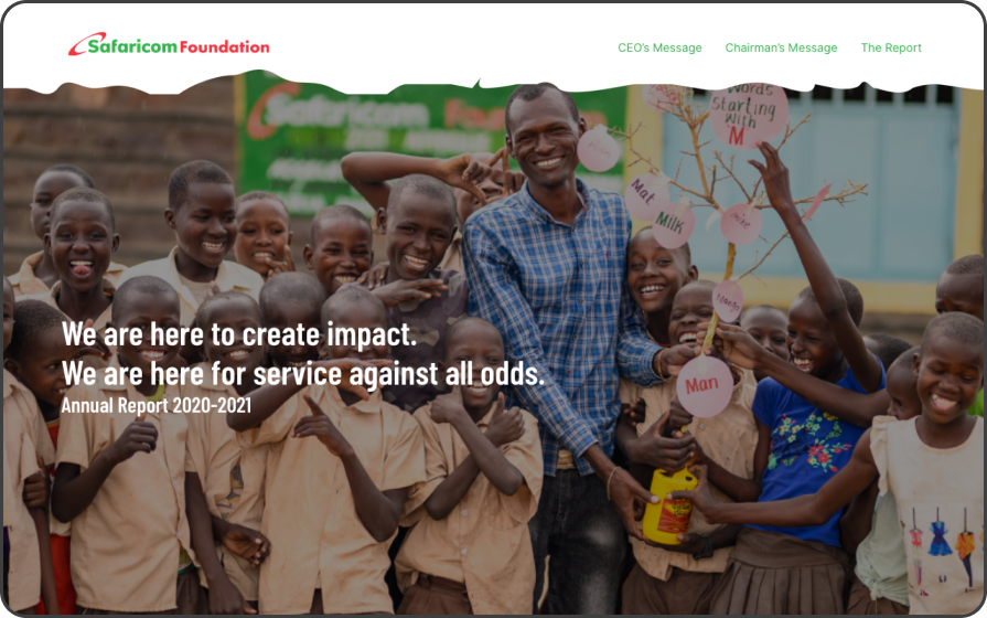
On the second version, I went back to the PDF for clues. The use of organic shapes, illustrations and colors stood out to me. They were used to add life to an otherwise mundane document.
With this in mind, I teamed up with a talented graphic designer to pull out the illustrative elements and recreate them for web use. I then incorporated them into the layout while still managing to stay on brand. Visitors could still access the mobile friendly interactive PDF which consisted of auto-flipping pages, the ability to view it as a slideshow and downloadable.
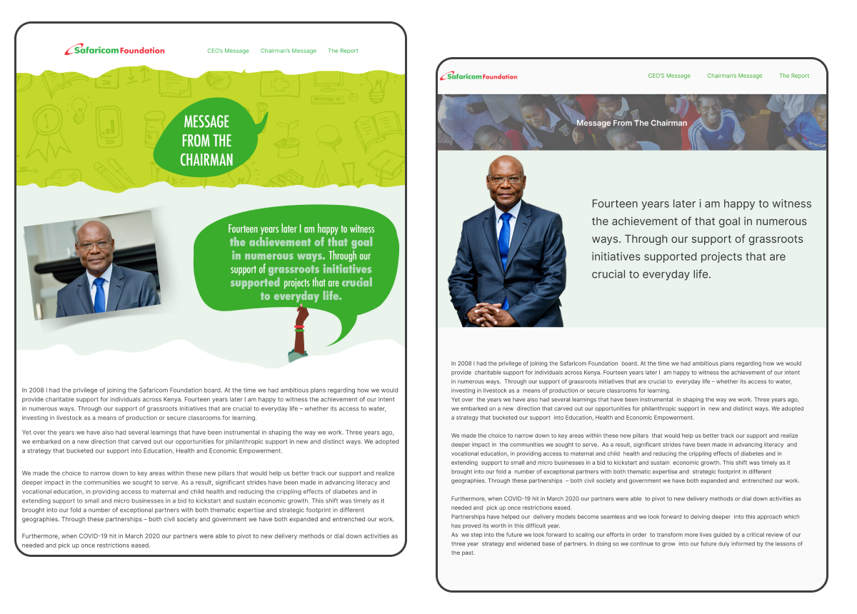
Responsiveness & fluidity
The result: increased client satisfaction
Lesson: Expect the unexpected & collaboration makes it good.
It is possible to execute successfully as requested and fail. When that happens, respond and don’t react. Navigate the challenge through getting clarity: ask questions, get clarity and ask more questions until it all becomes clear. Never get too attached to your work. Secondly, teaming up with other creatives brings a fresh perspective and plays a pivotal role in a project’s success. So reach out and ask for help.

Next
Let's Connect
If you’re seeking a designer who combines expertise with authenticity, let’s collaborate. I’m here to bring your digital ideas to life.

