saas-parabola-hero

SaaS landing page

Context

This concept was for a concept SaaS company selling audio production software as a cloud service. The target audience was music producers and podcast creators.

Challenge

How do we make a SaaS landing page stand out from other landing pages out there?

Type

Landing page

Role

UI/UX design
Web development

Live project

My Approach

My solution was to integrate current design trends to create a premium, clean and aesthetic layout. How? By using a mash up of these trends: aurora gradients, dark mode and bento boxes.

I began by selecting the 3 design trends as they piqued my interest: dark mode, aurora gradient and bento box have been used by well-known brands with excellent results (at least visually). From Apple to everyone else after, they have stood out as sure bet patterns and for good reasons:

  1. Dark mode reduces eye strain and fatigue, particularly in low-light environments. It provides a visually comfortable experience for users, positively contributing to prolonged engagement on the website.
  2. The use of aurora gradients creates visually appealing and immersive designs that captures attention and makes the website more engaging. This results in a more enjoyable and memorable user experience.
  3. With bento box grids, you get a modular organized layout, enhancing the overall visual appeal of a website. It also presents content in a clear and digestible way improving navigation and comprehension.

The beginning

For the first version, the audio software interface was based on a generic image and this directed the general color of the landing page. Wanting to push this further, I decided to design my own software interface, steering the layout towards darker tones.
saas landing page v1 vs v2
Final version vs version 1
the parabola software interface
The parabola software interface

The result: over 1K views

The project received some positive feedback from the social media community in a period of 60 days: over 250 impressions on LinkedIn and 1,985 views on Dribbble. Sharing the project on socials was a form of validating assumptions and design choices made.

Lesson: Sharing leads to growth

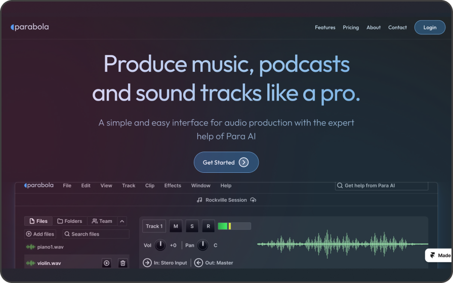
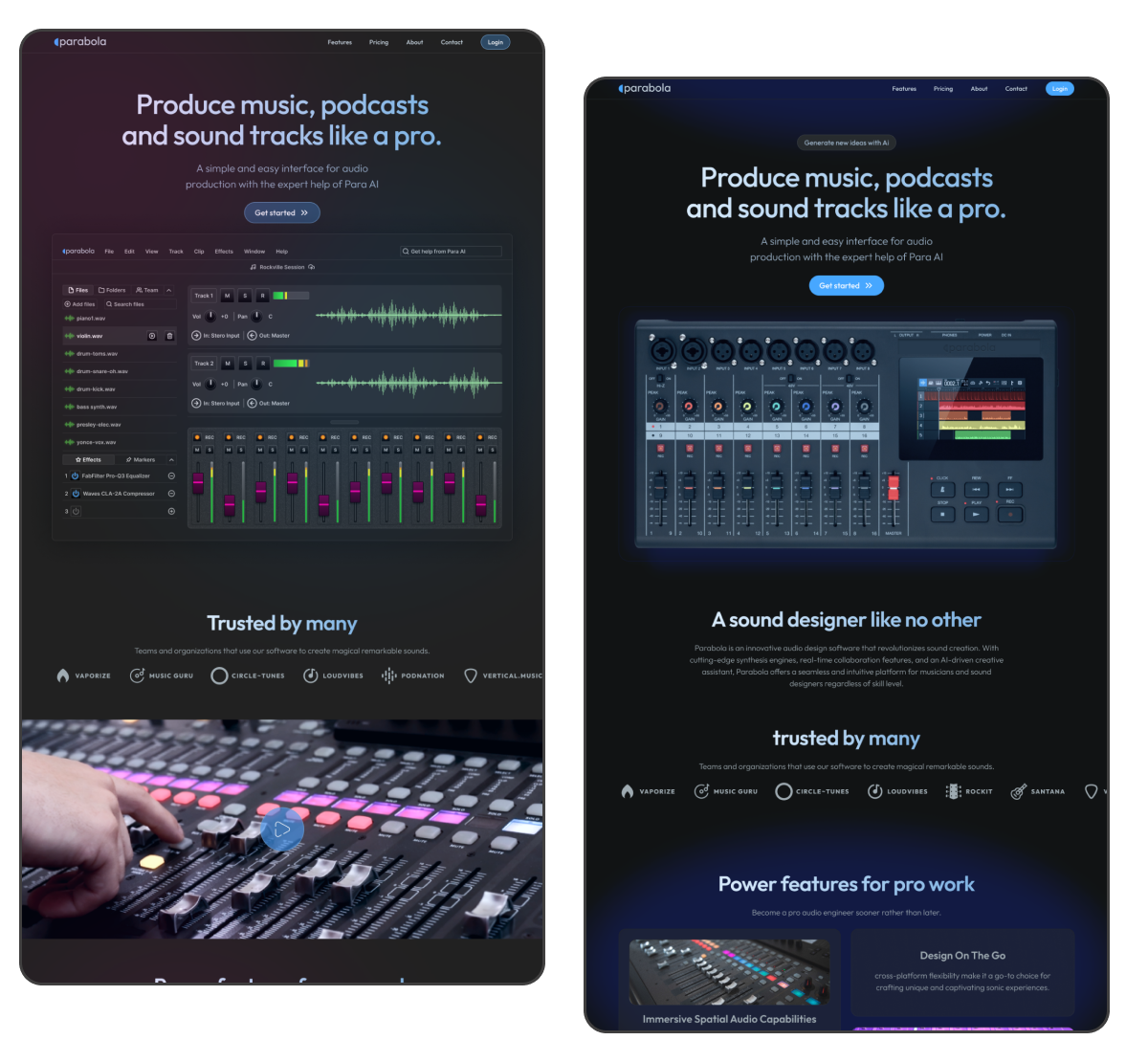
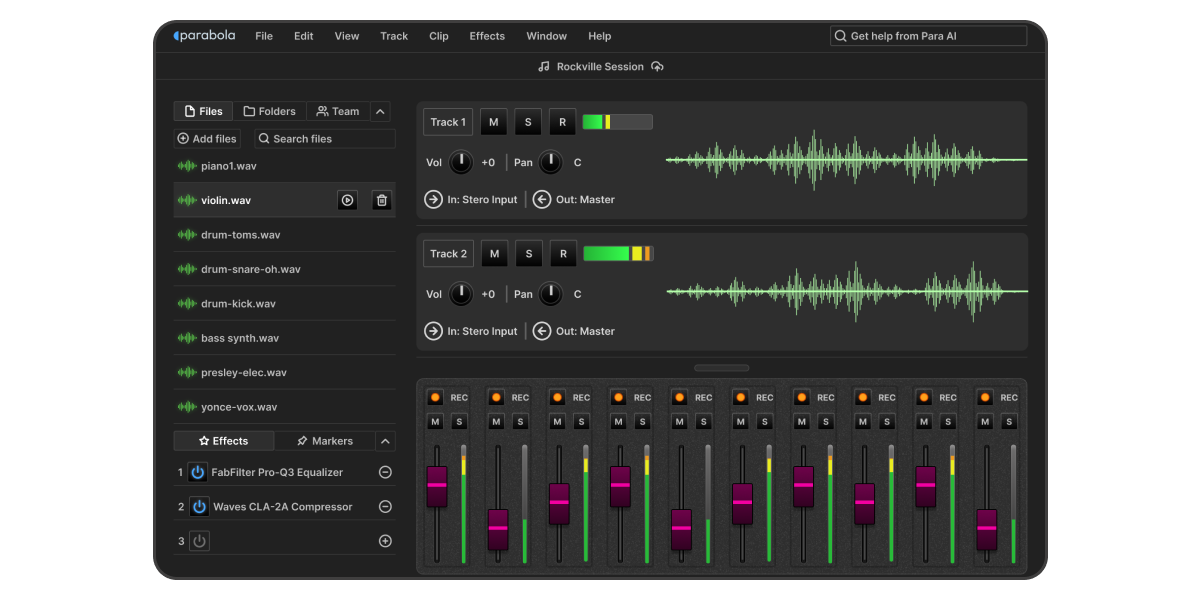
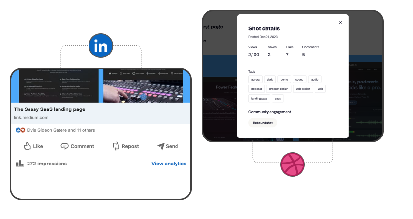
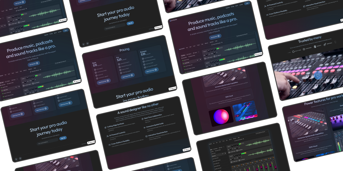
This concept experimented on incorporating dark mode, aurora gradients, and bento box grids to create a visually appealing, user-friendly, and modern landing page that positively impacts user satisfaction and brand perception. Through sharing this concept, I was able to get feedback from fellow designers and non-designers alike. It’s important to share and not work in isolation so as to get feedback, build your design muscle and confidence.

Next

crypto-app-design-coin-magnet

Stacking up wealth with crypto

The Safaricom foundation report website.

Presenting an ordinary PDF in an engaging way

Let's Connect

If you’re seeking a designer who combines expertise with authenticity, let’s collaborate. I’m here to bring your digital ideas to life.

Scroll to Top