This app was designed as part of the coursework for the Dribbble Product Design course in 2023. The objective was to design a crypto app experience targeted at beginners with an interest in learning and investing in crypto currency.
Challenge
How can I hold the beginner’s hand and ensure they achieve their goal?
Type
Mobile app
Role
UI/UX design Prototyping
Tools
Figma
My Approach
I started by recalling my first experience with a crypto app. Binance was the first crypto app I interacted with…and it was complex. On first run it gave you the advanced option that was full of gibberish. Upon playing around in the app, I stumbled upon the toggle to the basic version which still had a lot of jargon but compared to the advanced option I was first served, it felt less intimidating. The learning curve was steep and so I wanted to make an app that mitigated this.
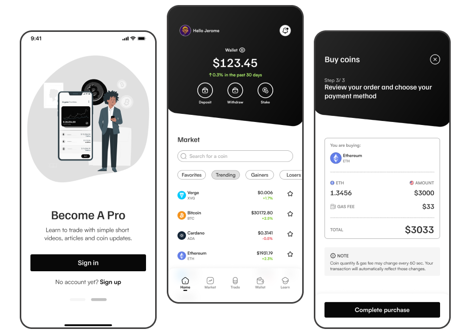
I designed an experience that kept everything simple without making assumptions as to what the user might already know. I did this using a variety of combinations:
Simple language eliminating crypto jargon.
Minimal color palette so the spotlight would stay on the content.
Brief descriptions for possible actions available.
Illustrations and images for visual relief.
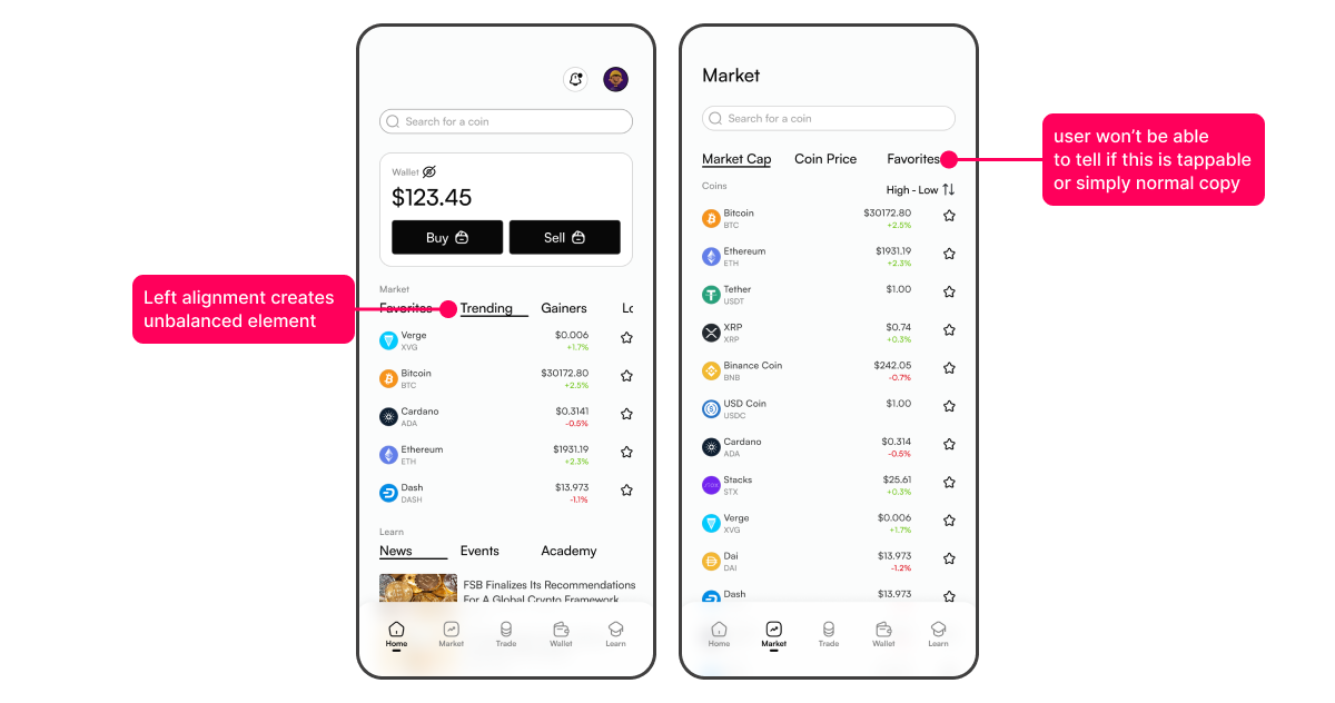
A lack of clarity in the first version
The focus features were sign up, browse coins, view coin details, and trade. I created the initial version and received feedback from my mentor, mainly addressing issues like the copy being too small and unclear distinctions between action points and normal copy.
Take 2: clearing the knots & testing
After making these adjustments, I tested a prototype with individuals unfamiliar with cryptocurrency. They successfully navigated through the tasks of signing up, exploring coins, learning about them, and making a purchase.
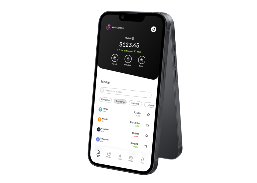
Encouraged by positive results, I directed my efforts toward enhancing the layout. Specifically, I believed the home screen had a generic and overused design that could use a fresh layout. The color choices were based on simplicity: black and white, no fluff.
The goal was to align the smooth user experience with a layout that complemented it, recognizing the importance of aesthetics. We understand and judge a product first through our eyes. A visually appealing design can enhance the perception of a product and elevate the overall experience.
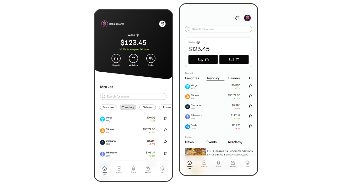
Final version vs version 1
Play Video
The prototype
Lesson: Become one with the iteration loop
Iteration is a never-ending cycle in a product’s existence and should be fully embraced. We iterate to make things better for our target users. One major factor is simplicity. By keeping the experience as simple as possible like using short, concise, jargon free language and adding brief descriptions for technical actions in your app, the experience can be delightful and less intimidating. Add a complementing look and you have a winner…until the next iteration.